

At a glance
At a glance answers how many incidents you’re declaring, and where they’re coming from. It’s the dashboard to open first when you want a broad read on how much your team is dealing with. It charts incident creation over time, then breaks that down by source (such as alert sources or users), by the person who created each incident, and by any custom field. Needs: the Response product.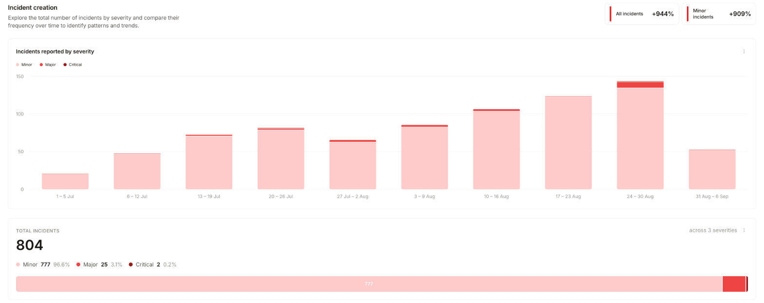
Teams
Teams answers which teams are carrying the incident load, and how they’re doing on post-incident work. It shows the status of post-incident tasks and follow-ups, and the time spent on incidents, grouped by team or user. Needs: the Response product, and teams set up in Catalog, including a link from your incident.io User type to a Team. If you see a welcome screen instead of data, see Teams troubleshooting.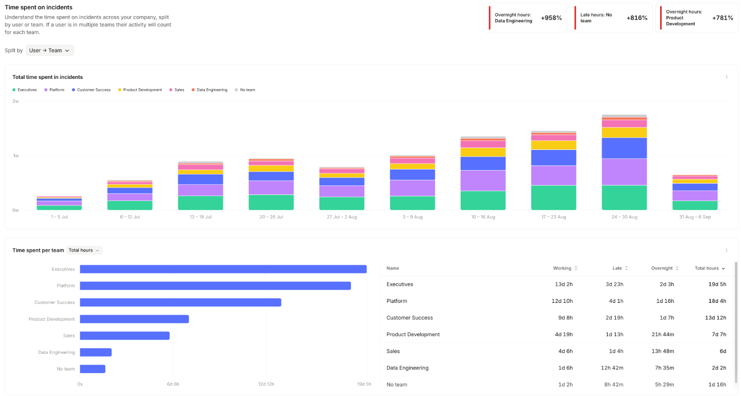
Time spent on incidents
Time spent on incidents answers how many hours responders are putting into incidents, and at what time of day. It shows time spent across your organization by time of day, and time spent grouped by any custom field. The hours come from workload metrics, which infer effort from activity in each incident. Time an incident spends paused is excluded, so the figures reflect active effort. Each hour is placed in a working, late, or overnight band using the same rules as pager load, described in how out-of-hours is decided. Needs: the Response product.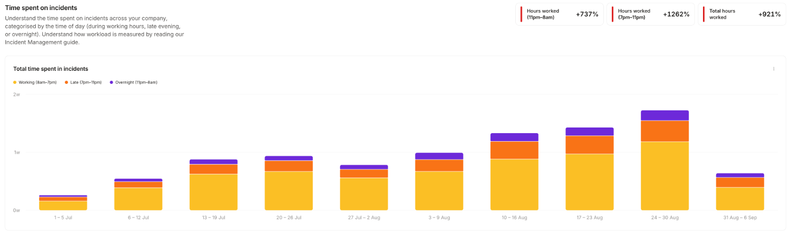
MTTX
MTTX answers how your response times are trending. It reports on your duration metrics, each of which measures the time between two incident timestamps. Use it to track MTTR, MTTD, and any other response-time metric, as a mean or a median. You can compare all your duration metrics side by side, follow a single metric over time, or group a single metric by any custom field. Needs: the Response product.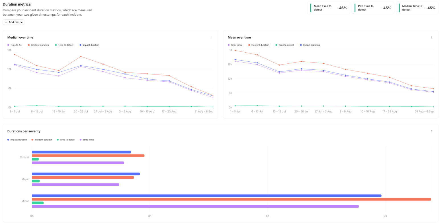
Custom metrics
You’re not limited to a fixed set of metrics. Define your own as the difference between any two timestamps in Settings → Response → Lifecycle, on the Timestamps and metrics tab, and they appear on MTTX alongside the built-in ones. Add a manually set timestamp such as “Impact started at” to measure from when impact began rather than when the incident was declared. See incident lifecycle for how timestamps are set.Follow-ups
Follow-ups answers how many follow-ups are open, who owns them, and whether they’re getting closed. It shows follow-up creation over time split by status, assignment, or a custom field, a status breakdown per assignee, and time to complete grouped by a custom field. Needs: the Response product, and at least one follow-up.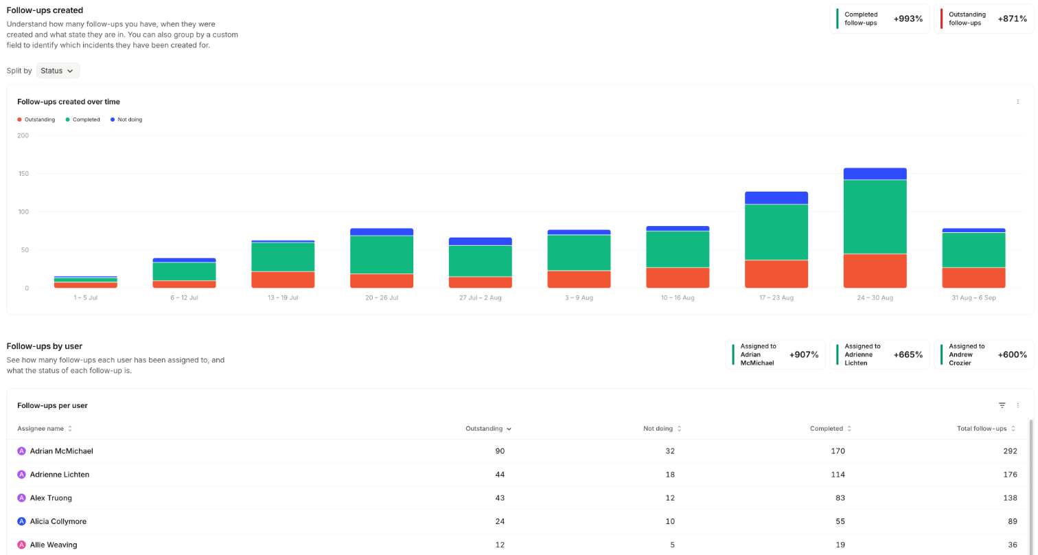
Post-incident flow
Post-incident flow answers whether incidents are making it through your post-incident flow. It shows which incidents enter the flow and what happens to them, and the outcomes of post-incident tasks grouped by a custom field. Needs: the Response product, a configured post-incident flow, and at least one custom field.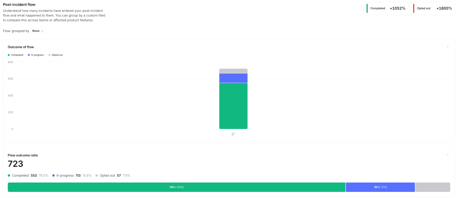
Alerts
Alerts answers how much your alerting is firing, and how much of it is noise. The dashboard has two halves: Alerts created covers volume and where alerts come from, and Alert acceptance covers how many alerts turn into accepted incidents and how many get declined. Needs: the On-call product.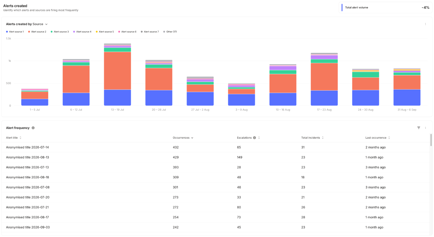
On-call readiness
On-call readiness answers whether everyone who might get paged can actually be reached. It shows how many on-call users are reachable by each notification method, and which methods each person has set up. Needs: the On-call product.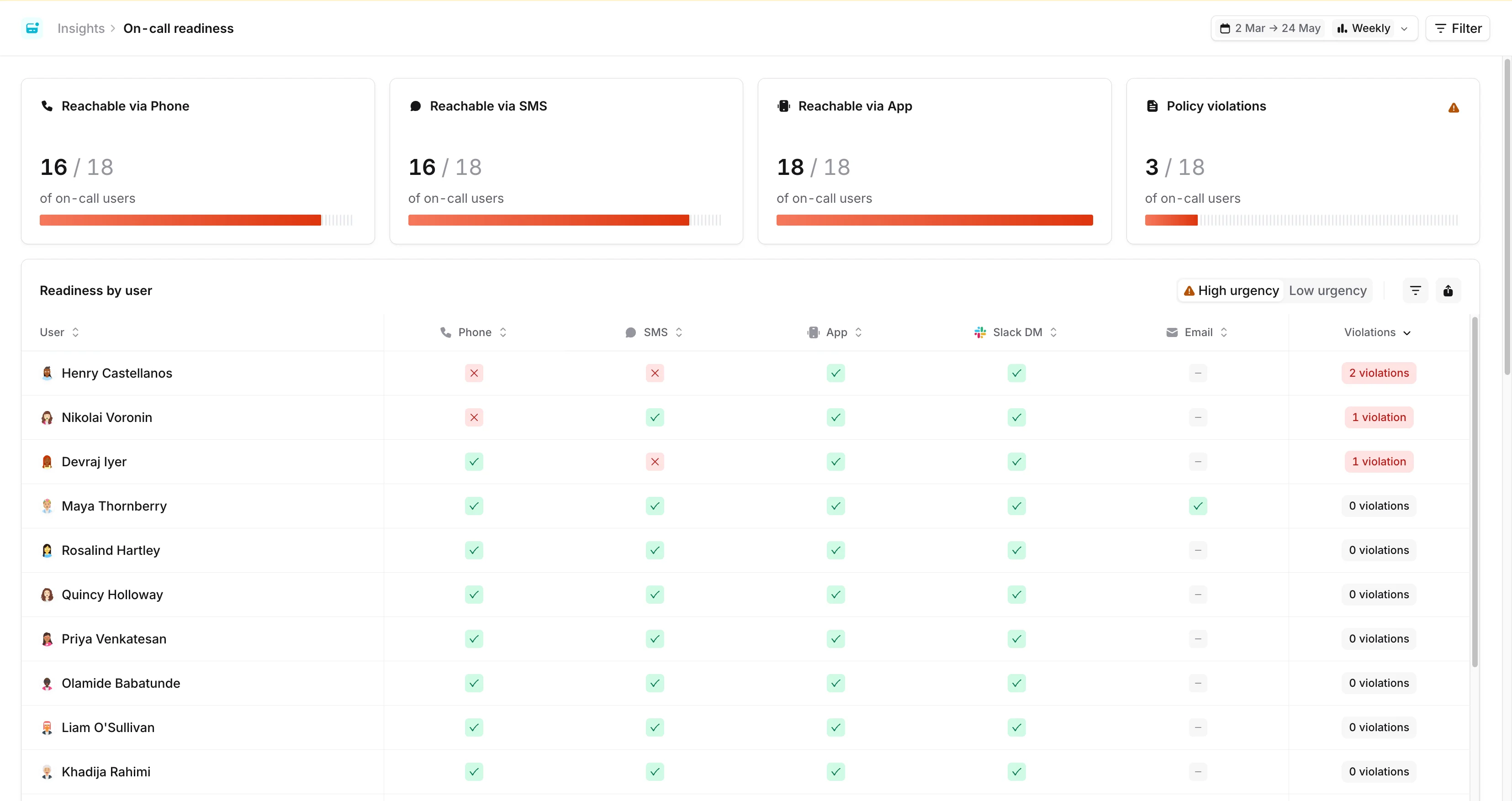
Pager load
Pager load is the dashboard to take to a leadership review when you want to talk about on-call burden rather than incident count. It answers how often each person is paged, at what time of day, how quickly they acknowledge, and how often a page went unanswered. Needs: the On-call product.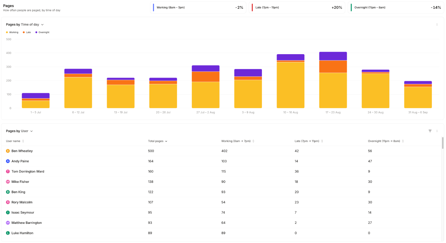
Filter and group the numbers
Filters apply to every panel on the dashboard: user, escalation path, schedule, urgency, trigger type, and any alert attribute. The charts and tables can be grouped by user, escalation path, trigger type, or any alert attribute. Once you have teams set up in Catalog, you also get two team group-bys: Escalation Path => Team, derived from the team that owns each escalation path, and User => Team, derived from the teams the paged person belongs to.Someone who belongs to more than one team contributes a row per team under User => Team, so the grouped totals
add up to more than the overall total. Group by Escalation Path => Team if you need the shares to sum.
Pager load (PagerDuty or Opsgenie)
Pager load isn’t limited to paging that went through incident.io On-call. Connect PagerDuty or Opsgenie and we import the paging those tools did, then report on it in a separate Pager load (PagerDuty) or Pager load (Opsgenie) dashboard. It answers the same question as pager load, for teams still paged through a third-party tool. Needs: the Response product, and PagerDuty or Opsgenie connected. You get pages over time by time of day, and pages per person, filterable by external user and by escalation policy, service, or team. Time of day is banded as described in how out-of-hours is decided, using the paged person’s timezone. These pages arrive the day after they happen, and history builds from the day you connect the integration. Escalation MTTA and missed escalations stay specific to incident.io On-call, because we can see that the other tool paged someone but not what they did next. When both are in play, the native dashboard is renamed Pager load (incident.io) so the two are easy to tell apart.How out-of-hours is decided
Every page is put into one of three bands based on the hour it arrived:
The dashboard labels them Working (8am – 7pm), Late (7pm – 11pm) and Overnight (11pm – 8am). Those labels appear in the trend tiles, the chart legend, and the per-user table headers.
The hour is calculated in the timezone of the person who was paged, not your organization’s timezone and not the viewer’s. A 3am page for someone in Sydney counts as overnight even if the person reading the dashboard is in London and saw it arrive over lunch.
We resolve that timezone in this order:
- The person’s timezone in incident.io. For Slack organizations we keep this in step with their Slack profile timezone, unless they have set their own in account settings, which then takes precedence.
- If we have no timezone for them, the most common timezone across your organization’s users.