Building a chart
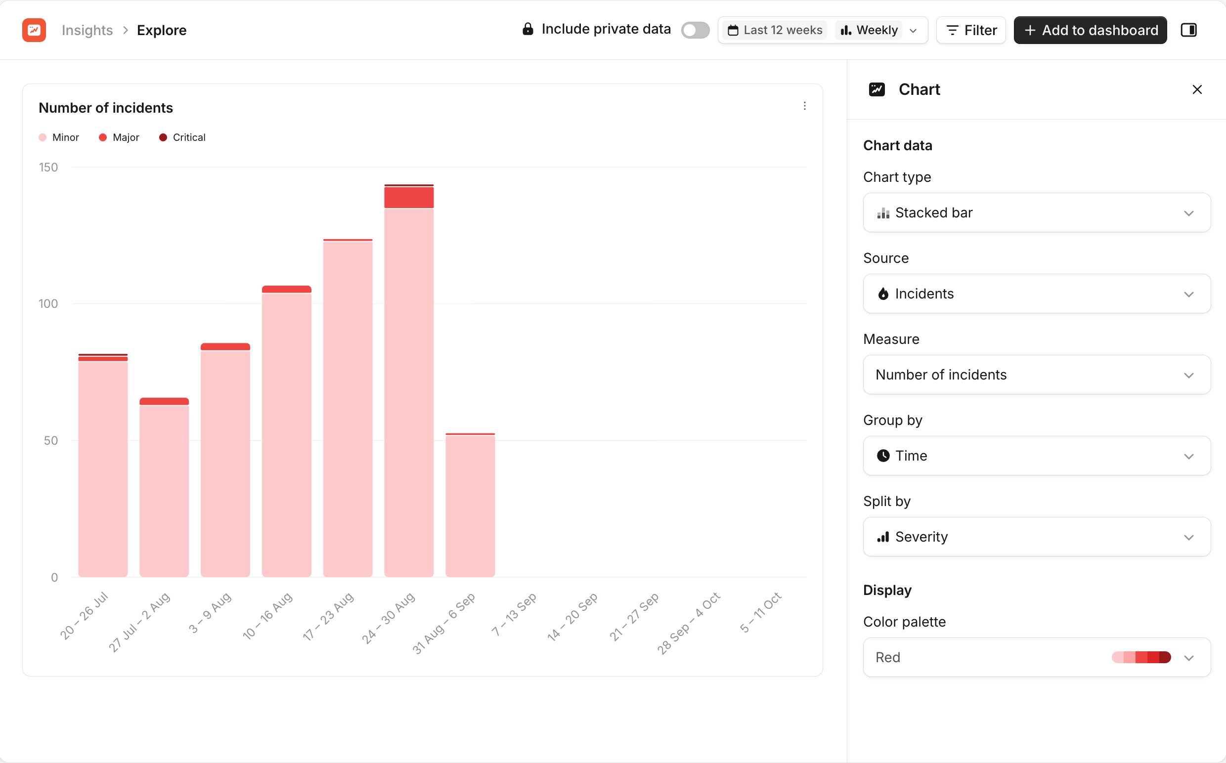
When you open Explore, the Chart sidebar asks what you want to chart. Choose a Measure. To narrow the list first, choose a Chart type or a Source, such as Incidents or Pages. Once you pick a measure, the chart appears and the sidebar shows its settings:- Chart type, Source and Measure: change what the chart shows and how.
- Group by: what each bar or point on the chart represents, such as Time.
- Split by: break the chart into series, such as one per severity.
- Color palette: change the chart’s colors.
Choosing the data
The header has the same controls as a custom dashboard:- The date picker sets the time period and Time interval, and turns on Compare with previous period.
- Filter limits the chart to the incidents, alerts or pages you care about.
- Include private data adds private data you have access to, if you see it.
Sharing a chart
Everything you choose in Explore is saved in the page’s URL. Copy the URL from your browser to share the chart. Anyone you share it with sees the same chart, with the data they have access to. If you chose a relative period, such as Last 12 weeks, the link always shows the latest 12 weeks.Adding a chart to a dashboard
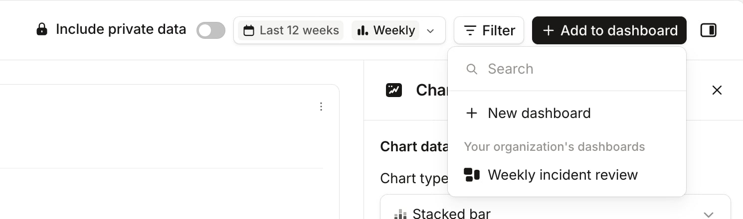
Click Add to dashboard in the header, then choose where the chart goes:- New dashboard makes a dashboard with your chart and Explore’s date range, and opens it in edit mode.
- An existing dashboard adds the chart to it and takes you there. The list shows the dashboards you can edit, under Your dashboards and Your organization’s dashboards.