When responders download the incident.io mobile app, they’ll be walked through an onboarding flow to add sensible defaults.
Reachability at a glance
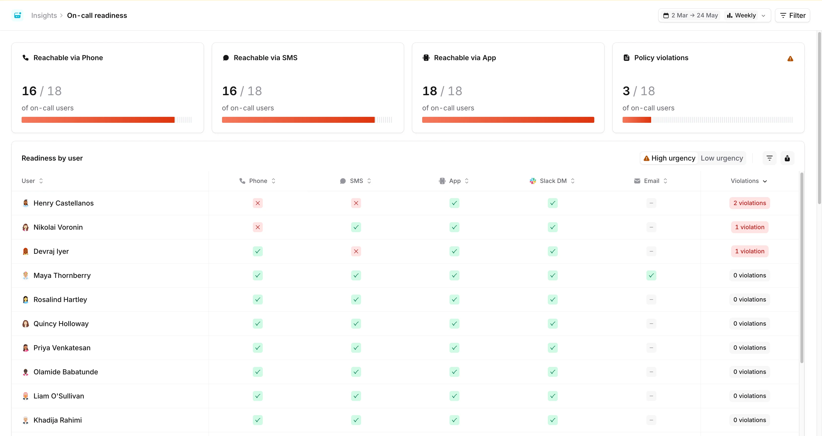
At the top of the dashboard you’ll see a row of KPI tiles, one per notification method (Phone, SMS, and App), showing the share of on-call users currently reachable by that method at high urgency. Click a tile to highlight the corresponding column in the table below. The selection is reflected in the URL, so you can share a link with a method already focused. Alongside the reachability tiles, the final card shows one of two things:- Policy violations: the share of on-call users who don’t satisfy your on-call readiness policy. This appears once you’ve configured a readiness policy.
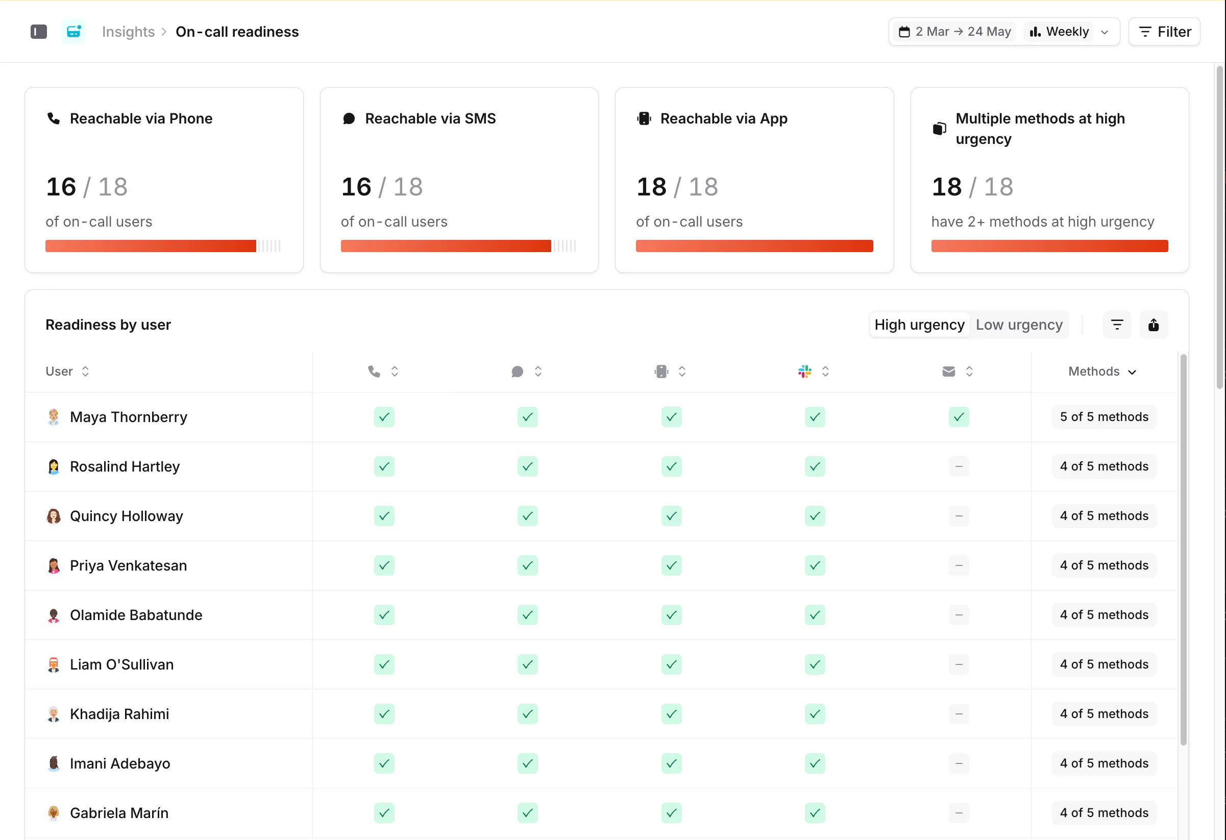
- Multiple methods at high urgency: the share of on-call users with two or more high-urgency methods configured. This is shown when no readiness policy is in place, as a useful proxy for redundancy.
Filter by escalation path or schedule
The KPI cards, table, and trend chart all respect the filters in the top bar. You can filter by escalation path, schedule, or both. This is useful if you’re migrating one team at a time, or if different teams have different processes in place.Drill down into each user’s configuration
Below the KPI row, the Readiness by user table lists every on-call user and the notification methods they have configured. A legend at the foot of the table maps the cell colours: configured, missing-and-required-by-policy, and not configured. Click a row to open that user’s notification settings in a drawer. When both high and low urgency methods are in scope, a segmented High urgency / Low urgency toggle appears in the top-right of the panel. Each option shows an amber warning badge with the number of users who have a policy gap at that urgency, so you can flip between the two views and see where attention is needed. Use the Export button next to the toggle to download the current table as a CSV. The export includes paired high/low urgency columns for each method, the user’s overall status, and any applicable on-call readiness policies.Notification configuration trends
The Adoption over time chart at the bottom of the dashboard tracks how your users’ notification configuration is changing. This is useful for following a migration. For example, you can watch whether onboarding sessions are driving readiness up over time. The chart uses the date range and aggregation (day or week) from the top of the page, with the last 12 weeks selected by default.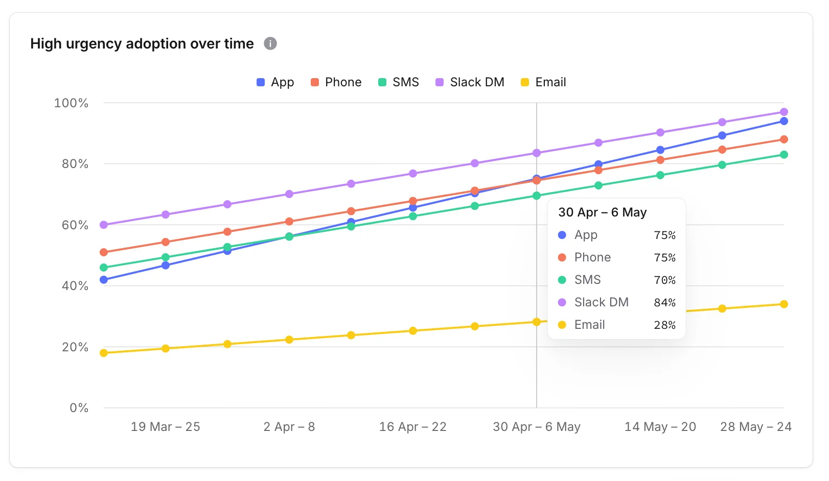
Mobile install breakdown
If your org has the mobile install breakdown enabled, you’ll see an extra panel showing the state of each user’s mobile app install: platform, app version, whether the app is installed, whether push is enabled, and the signals that govern whether a page can break through Do Not Disturb. This panel is currently in early access. Reach out if you’d like it enabled for your account.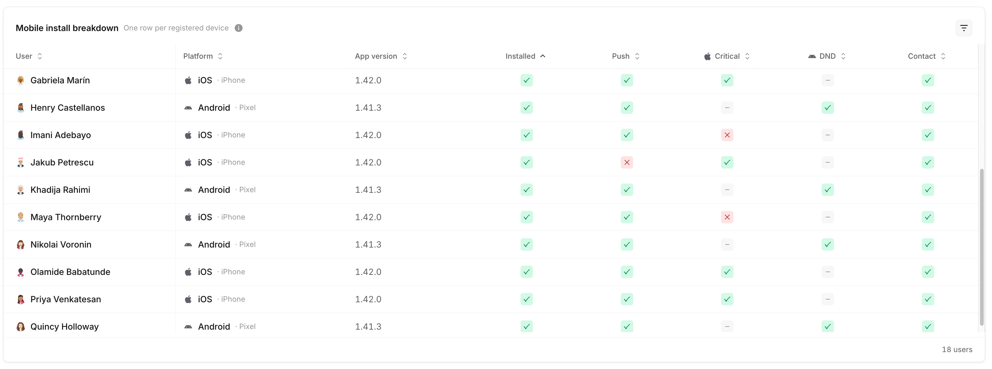
A couple of columns are platform-specific because iOS and Android handle Do Not Disturb differently:
- Critical: iOS only. Critical notifications make a sound regardless of silent mode or Focus / Do Not Disturb. See iOS notifications for the user-side setup.
- DND: Android only. Reflects whether the app has been granted Do Not Disturb access, which lets push notifications break through. See Android notifications for details.
- Contact: how iOS bypasses Do Not Disturb for phone and SMS. We can tell whether each responder has the incident.io contact card installed, but we can’t see whether they’ve enabled Emergency Bypass on it, so a green check confirms the contact is saved but not that DND bypass is wired up end to end.
China region
If anyone in your organization needs to use the China-specific build of the incident.io mobile app, the Mobile install breakdown panel adds a Region column showing whether each device is registered against the Global or China app. This makes it easy to confirm that responders in mainland China are installed against the right build.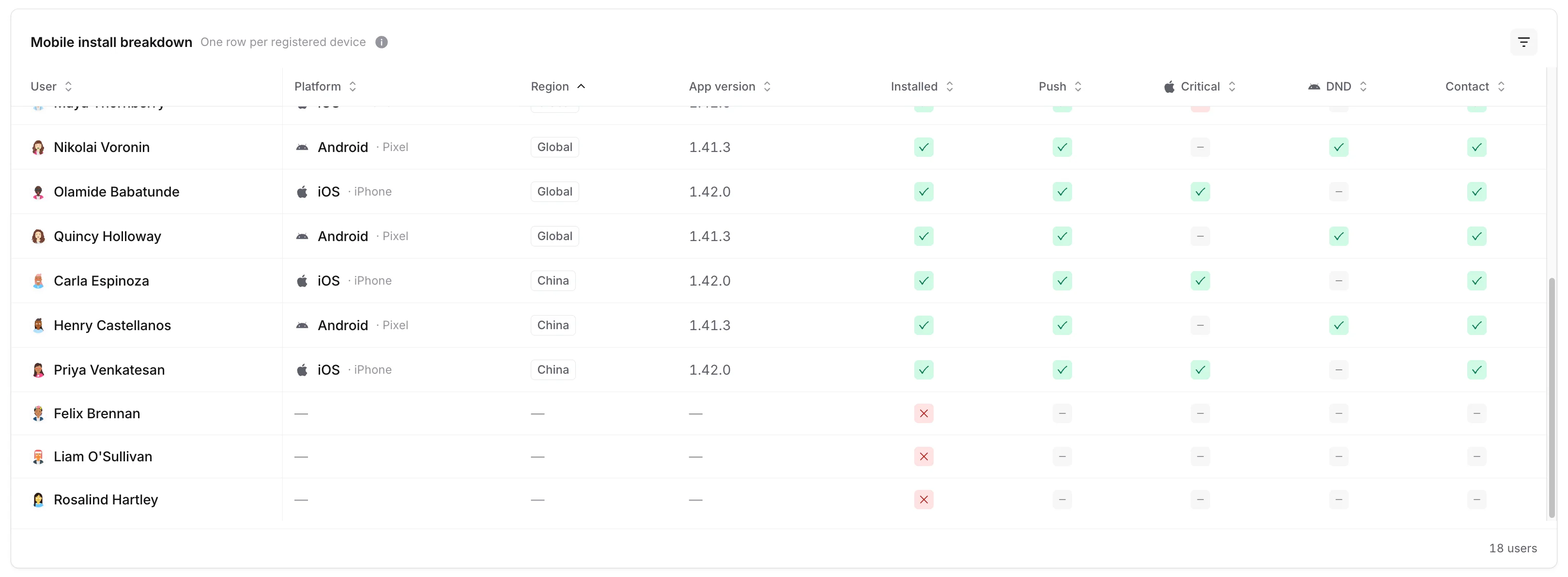
The China app is a separate build of the mobile app for users who can’t reach the Global app’s push infrastructure. See Supported countries for On-call notifications for the wider picture on regional availability.
FAQs
Why does the dashboard show two different KPIs in the trailing card?
Why does the dashboard show two different KPIs in the trailing card?
The trailing card swaps based on whether you’ve configured an on-call readiness policy. With a policy in place, it shows Policy violations so you can track adherence. Without one, it shows Multiple methods at high urgency, a useful proxy for redundancy when you don’t yet have a defined bar to measure against.
What counts as a policy violation?
What counts as a policy violation?
A user is in violation if they’re missing one or more notification methods required by an on-call readiness policy that applies to them. Policies can require specific methods at high urgency, low urgency, or both. The status pill on each row counts unmet statements rather than missing cells, so a policy like “app OR email at high urgency” only counts once if both are missing.
How often does the dashboard update?
How often does the dashboard update?
The dashboard reads live notification configuration each time you load the page. The adoption-over-time chart is sampled daily, so changes a user makes today will show up on tomorrow’s data point.
Why can't I see the Mobile install breakdown panel?
Why can't I see the Mobile install breakdown panel?
The Mobile install breakdown is currently in early access and rolled out per organisation. If you’d like it enabled for your account, reach out to the incident.io team.
Can I see what one user is set up with, without leaving the dashboard?
Can I see what one user is set up with, without leaving the dashboard?
Yes. Click any row in the Readiness by user table to open that user’s notification settings in a side drawer, including which methods they have configured at which urgencies.