> ## Documentation Index
> Fetch the complete documentation index at: https://docs.incident.io/llms.txt
> Use this file to discover all available pages before exploring further.
# Explore
> Build a chart from any Insights measure without making a dashboard first, then share it or add it to a dashboard.
Explore lets you build a single chart from any Insights measure, without making a dashboard first. Use it to answer a one-off question, then share the link or add the chart to a [custom dashboard](/insights/custom-dashboards).
Explore is available on Pro and Enterprise plans. To open it, click **Explore** in the top right of the [Insights homepage](https://app.incident.io/~/insights). You can also open any custom dashboard chart in Explore from its **⋯** menu, with **Open in explore**.
## Building a chart
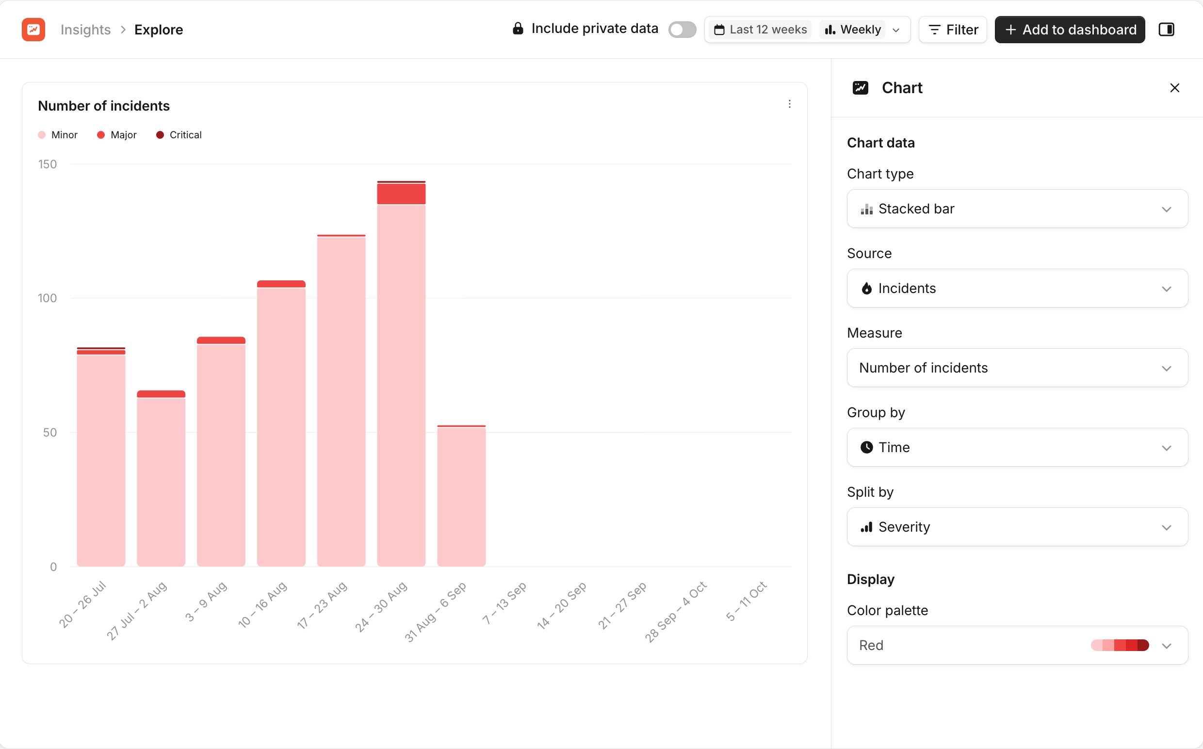
When you open Explore, the **Chart** sidebar asks what you want to chart. Choose a **Measure**. To narrow the list first, choose a **Chart type** or a **Source**, such as **Incidents** or **Pages**.
Once you pick a measure, the chart appears and the sidebar shows its settings:
* **Chart type**, **Source** and **Measure**: change what the chart shows and how.
* **Group by**: what each bar or point on the chart represents, such as **Time**.
* **Split by**: break the chart into series, such as one per severity.
* **Color palette**: change the chart's colors.
Some measures ask for more, such as which duration metric or statistic to show. See [supported measures](/insights/supported-measures) for every measure and the chart types it supports.
 ## Choosing the data
The header has the same controls as a custom dashboard:
* The date picker sets the time period and **Time interval**, and turns on **Compare with previous period**.
* **Filter** limits the chart to the incidents, alerts or pages you care about.
* **Include private data** adds private data you have access to, if you see it.
These work the same way as on a dashboard. See [date range and comparison](/insights/custom-dashboards#date-range-and-comparison).
The chart's **⋯** menu has **View underlying data**, **Export CSV** and **View full screen**. See [viewing underlying data](/insights/custom-dashboards#viewing-underlying-data).
## Sharing a chart
Everything you choose in Explore is saved in the page's URL. Copy the URL from your browser to share the chart. Anyone you share it with sees the same chart, with the data they have access to.
If you chose a relative period, such as **Last 12 weeks**, the link always shows the latest 12 weeks.
## Adding a chart to a dashboard
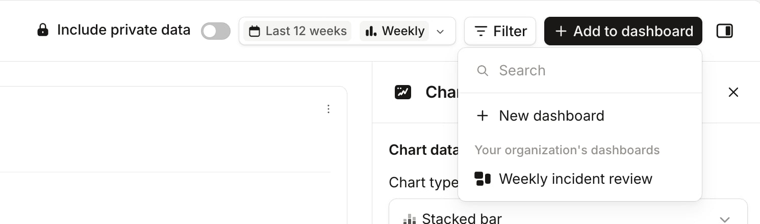
Click **Add to dashboard** in the header, then choose where the chart goes:
* **New dashboard** makes a dashboard with your chart and Explore's date range, and opens it in edit mode.
* An existing dashboard adds the chart to it and takes you there. The list shows the dashboards you can edit, under **Your dashboards** and **Your organization's dashboards**.
## Choosing the data
The header has the same controls as a custom dashboard:
* The date picker sets the time period and **Time interval**, and turns on **Compare with previous period**.
* **Filter** limits the chart to the incidents, alerts or pages you care about.
* **Include private data** adds private data you have access to, if you see it.
These work the same way as on a dashboard. See [date range and comparison](/insights/custom-dashboards#date-range-and-comparison).
The chart's **⋯** menu has **View underlying data**, **Export CSV** and **View full screen**. See [viewing underlying data](/insights/custom-dashboards#viewing-underlying-data).
## Sharing a chart
Everything you choose in Explore is saved in the page's URL. Copy the URL from your browser to share the chart. Anyone you share it with sees the same chart, with the data they have access to.
If you chose a relative period, such as **Last 12 weeks**, the link always shows the latest 12 weeks.
## Adding a chart to a dashboard
Click **Add to dashboard** in the header, then choose where the chart goes:
* **New dashboard** makes a dashboard with your chart and Explore's date range, and opens it in edit mode.
* An existing dashboard adds the chart to it and takes you there. The list shows the dashboards you can edit, under **Your dashboards** and **Your organization's dashboards**.